Saveena's Wireframes
Desktop Wireframe

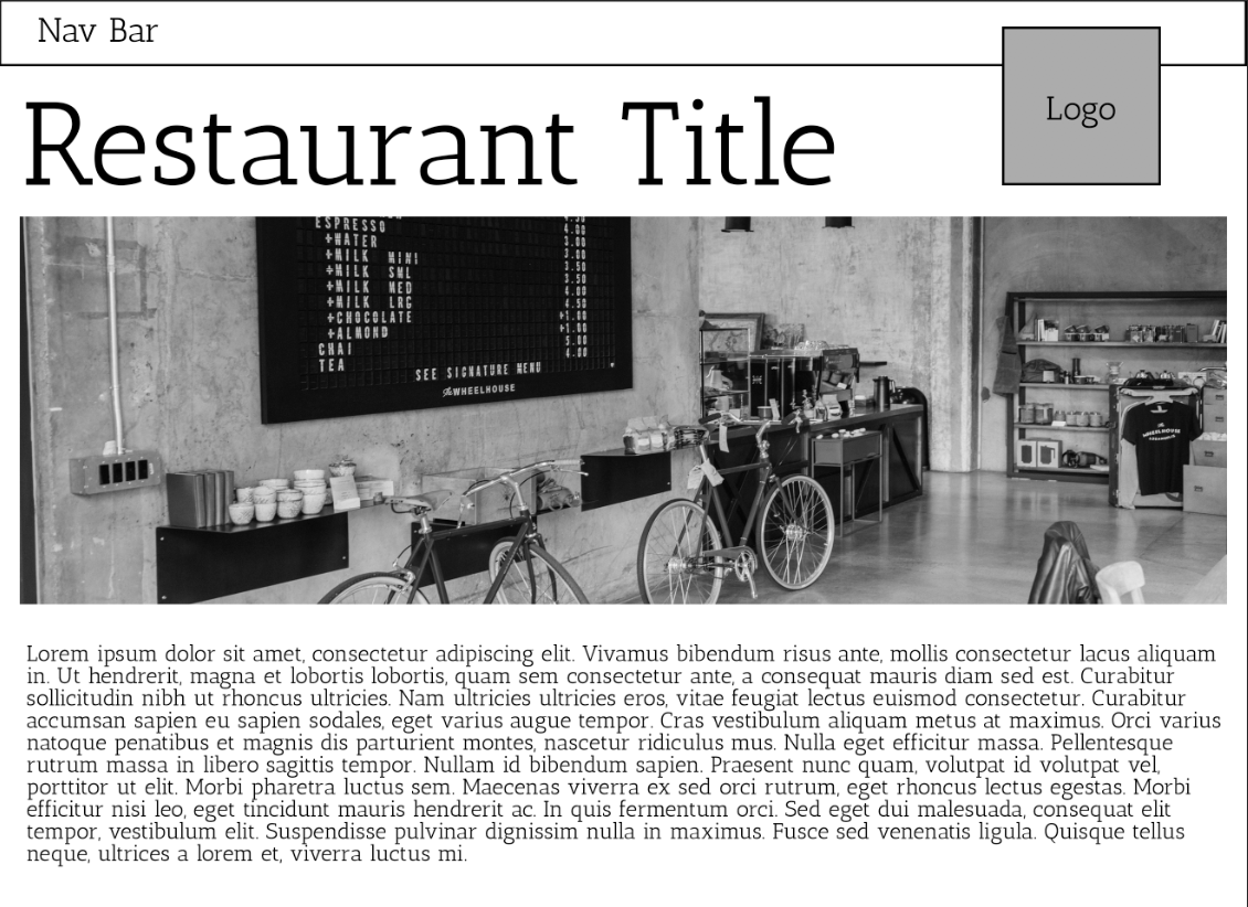
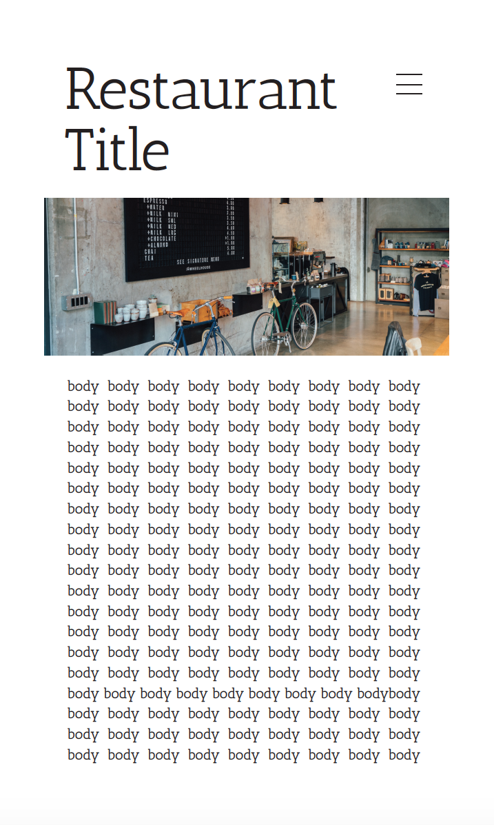
I chose to make the website for the restaurant minimalistic. The restaurant I envisioned was very sleek and simple but classic, which is why I chose a minimal design. The placement was pretty simple for that reason. I chose the image because I thought it captured the restaurant that I imagined, which matched my wireframe choice.
Mobile Wireframe
